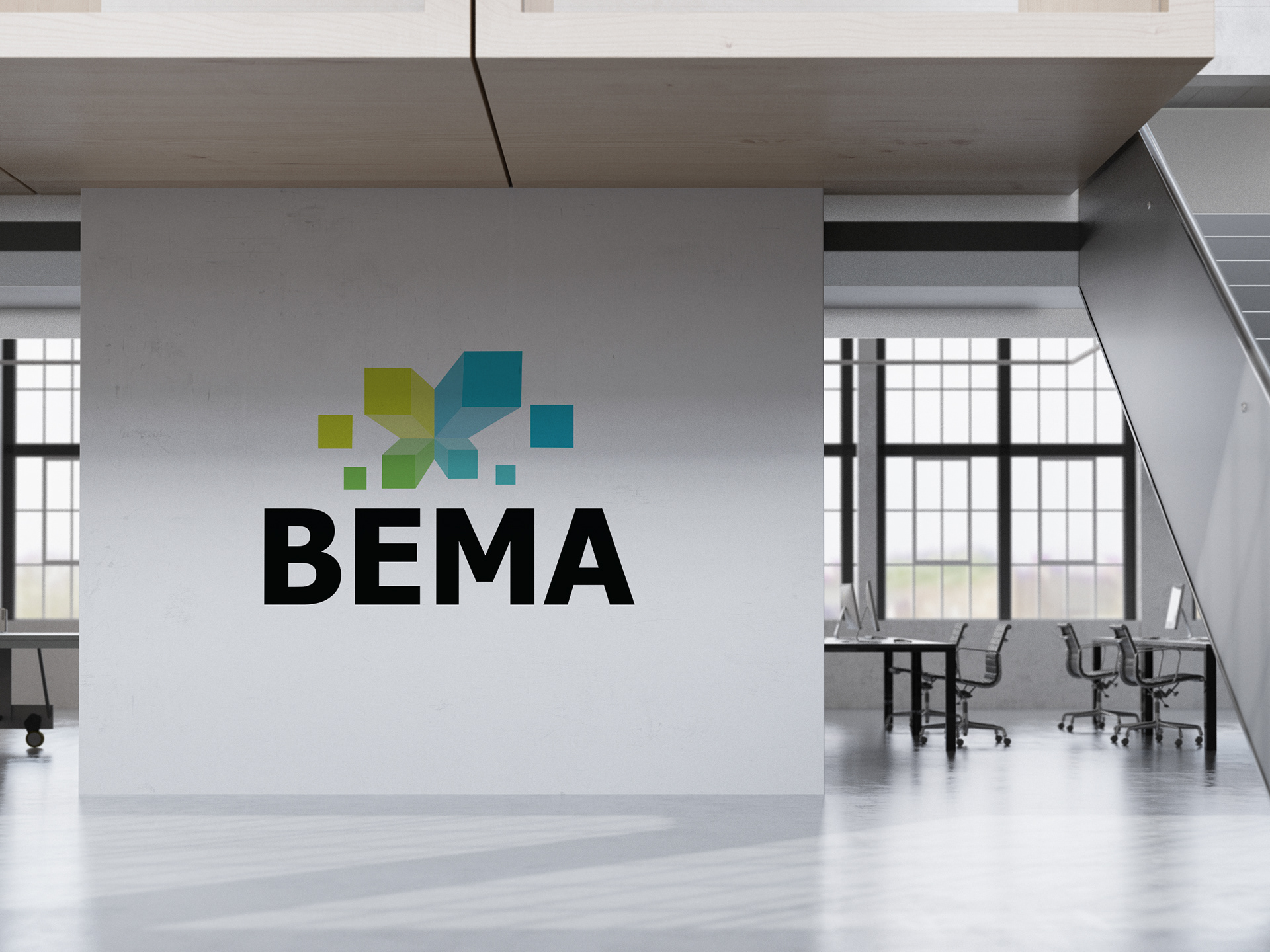
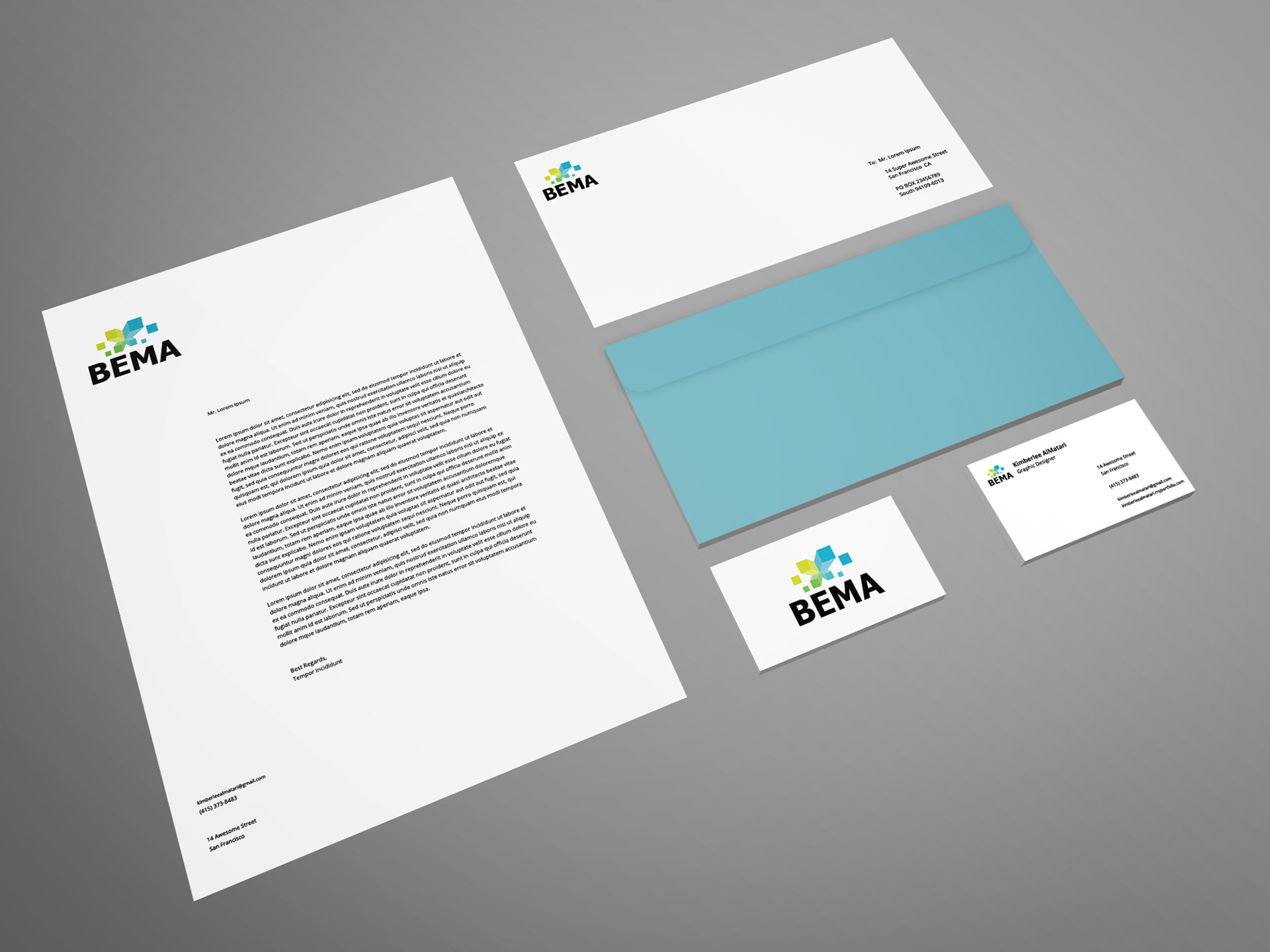
My concept for the logo was a play on pixels. I felt this was a component that worked for all four units of the department. I chose an analog color pallet, further unifying the parts as a whole, giving it a bold, geometric typeface, that stands strong and timeless.